1. Typography: The Voice of Data
Robert Bringhurst, in The Elements of Typographic Style, describes typography as "tribal customs" that signal belonging to a civilized discourse - a tongue distinct from speech, through which authority speaks visually rather than verbally.
The "Serif Credibility" Effect
Research indicates that font choice triggers immediate emotional and cognitive responses. The most famous demonstration of this is the "Baskerville Effect" - an experiment conducted by documentarian Errol Morris and Cornell psychologist David Dunning with 45,000 New York Times readers. Participants were shown identical statements in different fonts (Baskerville, Comic Sans, Computer Modern, Georgia, Helvetica, and Trebuchet). Readers were statistically more likely to agree with statements written in Baskerville, a serif font. While the advantage was 1.5%, Dunning noted that in large-scale contexts like elections or marketing campaigns, such a shift in persuasion is "huge."
Professional contexts show even stronger effects. A 2024 study found that 67% of hiring managers associate serif fonts with trustworthiness, while documents using standard professional typography see engagement rates increase by up to 40% compared to decorative alternatives. Serif fonts signal history, academia, and permanence; sans-serif fonts signal modernity, approachability, and digital utility.

How the Three Institutions Use Typography
All three institutions follow the same pattern: custom serif fonts signal exclusivity and permanence, while sans-serif fonts provide utility and modernity. The custom nature of these fonts is crucial - they are voices that cannot be replicated by default software, creating instant brand recognition and signaling investment in quality.
McKinsey
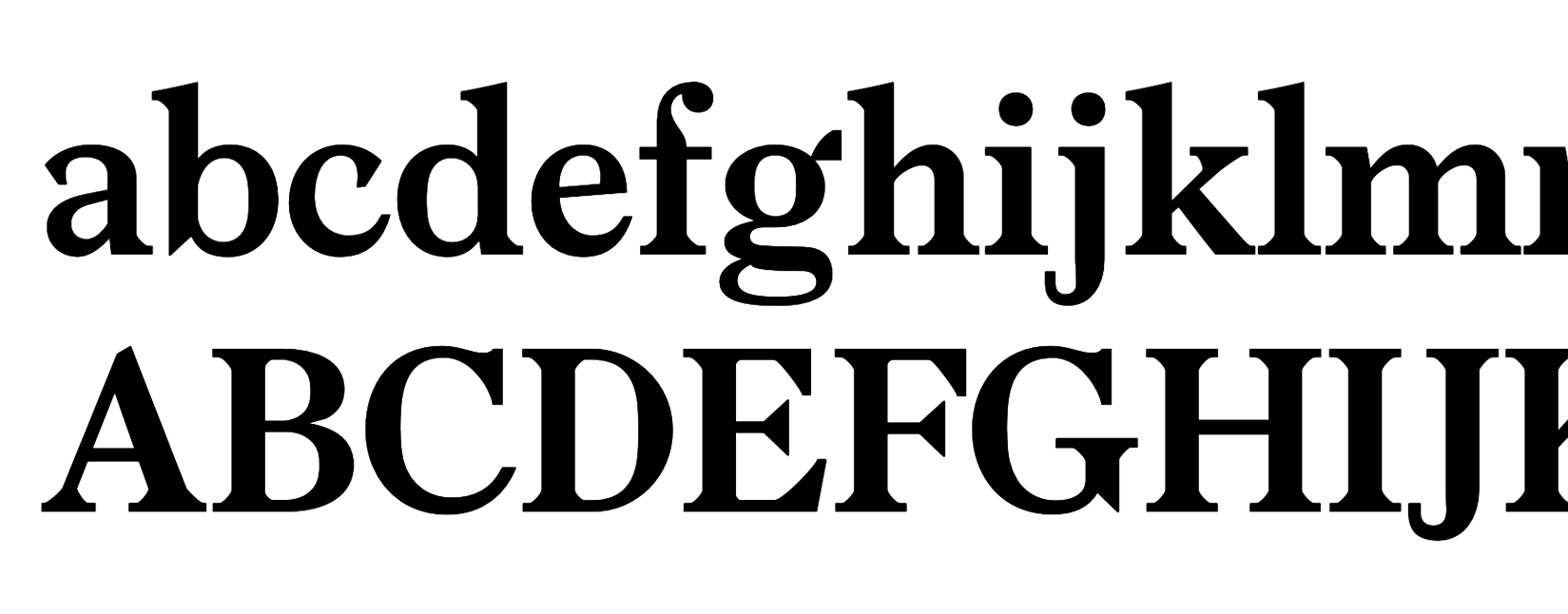
Bower - a custom serif named after Marvin Bower, the "father" of modern management consulting. The font is characterful and bold, with a slight "chiseled" quality that suggests permanence and gravitas. Paired with McKinsey Sans for body text.
Pragmatic Concession: Allows Georgia and Arial in PowerPoint presentations to ensure files don't break when shared with clients - reliability over purity.
"A broken font file undermines authority more than a generic font does."
Financial Times
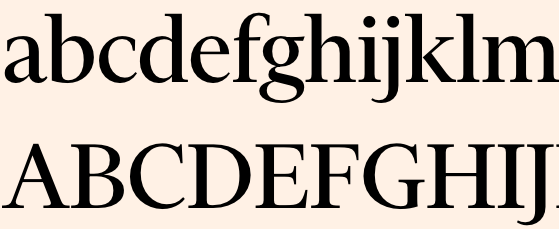
Financier - a custom serif commissioned in 2014, designed specifically to handle the density of financial news while signaling modernity. Lacks ball terminals (common in newspaper fonts) for a "sharper, more incisive" feel.
Performance Focus: Optimized for web speed - the font loads in milliseconds, ensuring that "authority" renders instantly on digital screens.
Two variants: Financier Display for headlines, Financier Text for body copy.
The Economist
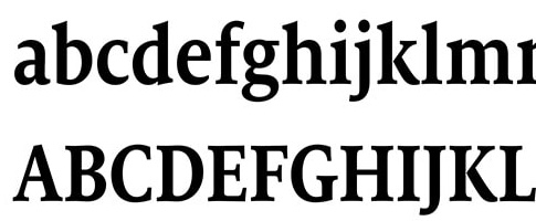
Milo Serif for body text - chosen because it was "cut for optimal legibility in both digital and print environments." Features more upright oval shapes and modern style with variance in strokes. Paired with Econ Sans (a customized version of Halifax) for headers and charts.
2018 Redesign: The first redesign in 17 years, replacing ITC Officina Display and New Eco. Art director Stephen Petch: "The new typefaces give pages an airier, less forbidding feel."
Econ Sans has uniform stroke width for readability across all sizes - part of a multi-year effort to align web and print typography. Their line graphs and bar graphs are instantly recognizable.
Logo Typography: Tribal Signaling
Typography choices in logos reveal which "tribe" a company wants to belong to. Compare two of the Big Three consulting firms: McKinsey uses a classic serif wordmark, while BCG uses a bold geometric sans-serif. Both are elite strategy consultancies, but their typography signals membership in different worlds.
McKinsey's serif wordmark signals: "We are the established authority - the firm that has advised governments and Fortune 500 CEOs for a century." BCG's geometric sans-serif signals: "We are the future of consulting - innovative, tech-forward, and ready for digital transformation." Neither is "better" - they're optimized for different positioning strategies.
Our take on fonts
The most authoritative brands use a hybrid approach to balance permanence and modernity: serif for deep reading and headlines (signaling heritage and expertise), and sans-serif for data, navigation, and utility (signaling efficiency and clarity). This pairing creates a visual system that feels both trustworthy and contemporary.


