Who is Edward Tufte?

Professor Emeritus, Yale University
© Andrei Severny
Edward Tufte is a statistician and professor emeritus at Yale University, often called the "Leonardo da Vinci of data."1 His 1983 book The Visual Display of Quantitative Information revolutionized how designers, journalists, and analysts think about presenting data.2
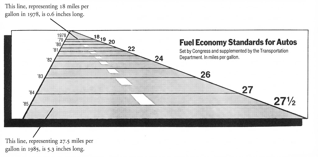
Tufte's core argument is simple but radical: graphical excellence is not about style - it's about truth.3 A chart should maximize the information conveyed while minimizing visual noise. Every pixel of ink should serve the data.
His influence extends far beyond academia. The Financial Times, The Economist, Bloomberg, and top consulting firms like McKinsey all build on his foundation.4 Their charts command attention because they follow these principles - treating data visualization as a form of intellectual honesty rather than decoration.
The Data-Ink Ratio5
Data-Ink Ratio = Data-Ink / Total Ink Used
A ratio of 1.0 means every drop of ink represents data. While this ideal is rarely achievable, Tufte argues designers should maximize this ratio by erasing non-data-ink (borders, backgrounds, unnecessary gridlines) and redundant data-ink (duplicate labels).4
"Above all else, show the data." - Edward Tufte